In the era of digital communication and social media marketing, the physical presence of real estate business cards might seem outdated.
However, in this communication-based industry, business cards still hold significant importance.
The real estate domain thrives on personal connections, effective networking, and making a strong first impression.
And what better way to introduce oneself to a potential client or collaborator than with a professional and striking business card?
We wrote this post to expand on real estate business cards in more detail, exploring why they’re still relevant, the different design ideas that can set you apart, and some of the best practices when creating your own card.
Whether you’re an experienced realtor looking to revamp your image or a newbie to the game, this guide will help you elevate your networking prowess.
Designing Your Real Estate Business Card
The design of your real estate business card plays a pivotal role in making that crucial first impression on whoever you hand it to.
Business cards for real estate agents should not only convey information but also speak volumes about professionalism, branding, and even personality.
Hence, investing time and creativity in your business card’s design can have lasting benefits.
Importance of Professional Design
Branding: Your card should align with your overall brand identity.
Consider it an extension of your professional profile, meaning every element should resonate with what you and your business stand for.
Memorability: A unique, eye-catching design will stand out among the stack of business cards a person might receive daily.
Make sure they remember you when they think of real estate.
Trustworthiness: A clean, professional design helps to instill confidence in potential clients, signaling that you’re serious about every aspect of your work.
Tips for Designing an Effective Business Card
Font Matters: Regardless of your brand identity, you should always choose a font that’s legible and easy to read, avoiding overly decorative fonts.
If you’re aiming for a more modern, sleek look, sans-serif fonts like Arial, Nunito, or Helvetica can be a good choice.
For a more classic, luxury vibe, you might consider serif fonts like Times New Roman or Georgia.
Color Scheme: Colors are key to evoking emotions and perceptions.
Blue can convey trust and stability, while red might represent passion and energy.
Either way, choose a color scheme that aligns with your brand.
Also, ensure there’s a good contrast between the background and text for readability.
Layout: The layout should be clean and easy to digest, not cluttered or trying to do too much at once.
Much like flyers and mailers, information should be organized hierarchically, with the most important details (your name and contact number) at the forefront.
Logo and Imagery: If you have a company logo, display it clearly on the card.
You might also consider adding a professional photo of yourself, depending on the vibe you’re aiming for.
You’re selling yourself, and this can make your card more personal, allowing people to put a memorable face to the name.
Special Features: With advancements in printing, you can add many unique features to your cards, such as embossing, indented features, or even QR codes that link directly to your personal website.
Back of the Card: Don’t neglect the card’s backside.
This can be an excellent space to put things like client testimonials while potentially serving as the base for information, allowing you to focus on branding on the front.
Branding in the front, business in the back!
Remember, your real estate business card is a physical ambassador of your brand, acting as a handheld real estate bio that you can hand out throughout your business journey.
While trends come and go, the key to real estate business card design is to focus on ideas that authentically represent you while remaining relevant to your target audience.
Essential Information to Include
Your real estate business card is a small but vital window into who you are and how potential clients can reach you.
But with the limited space no bigger than your average credit card, it’s crucial to decide what will make the most significant impact.
Here’s a look at the vital information every real estate agent should consider incorporating:
Contact Information
Phone Number: Perhaps the most direct, traditional way for clients to reach you, it’s vital that you ensure your number is prominent and easily legible.
If you have both an office line and a cell phone number, clearly specify which is which.
Email Address: An email address provides access to a more formal, written means of communication. Include a professional email address, preferably linked to your agency or a custom domain, avoiding casual or personal email addresses.
Website: Including your professional website or agency’s page gives potential clients immediate access to your listings, testimonials, and more details about your services.
Professional Title and Company Name
Professional Title: Clearly state your role, whether you’re a “Real Estate Agent,” “Realtor,” “Property Consultant,” or another title.
This clarifies your professional status and expertise to potential clients.
Company Name: Being associated with a reputable agency helps to add credibility while showcasing an ability to collaborate.
Ensure the company name is visible and include any logos for better brand recognition.
Social Media Handles
Why They Matter: In today’s digital age, many, especially younger, clients may first encounter you on social media platforms.
It’s a space where you can showcase your listings, share industry knowledge, and build a more personal connection, so including them on your business card is important.
What to Include: If you’re active on platforms relevant to real estate, such as LinkedIn, Instagram, or even a Facebook page, include those handles.
Make sure that any included profiles are professional and consistently updated.
Unique Selling Proposition (USP) or Tagline
Define Your Edge: A USP, slogan, or catchy tagline can help to differentiate you from the competition, quickly communicating what sets you apart or what clients can expect when working with you.
Examples: Your tagline could be something like, “Turning Your Dreams into an Address” or “Dedicated to Results.” Ensure it aligns with your brand and the message you want to convey.
Essentially, when crafting your real estate business card, the idea is to provide a concise yet comprehensive overview of who you are and how you can be reached.
Top 15 Effective Real Estate Business Card Design Ideas
We’ve put together 15 standout real estate business card designs that are not just visually appealing but effective in conveying a brand message.
Ryan Serhant
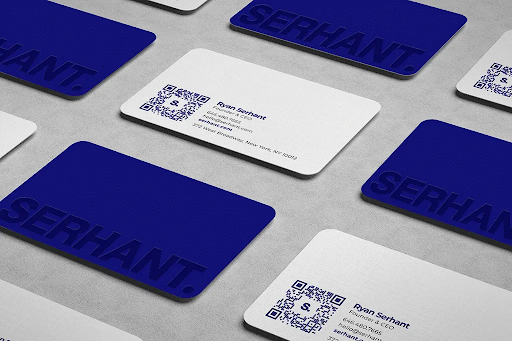
Ryan Serhant worked with a graphic designer to create a card that speaks to sophistication with a clean, minimalistic, modern appearance.
There’s no clutter, just essential details presented in a contemporary format.
Forefront Real Estate
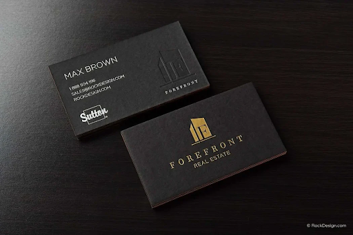
The black and gold contrast in the design of this card makes for a classic feel that’s instantly attention-grabbing.
The engraved details add a touch of luxury and class, making it all the more memorable.
aussieLA Real Estate
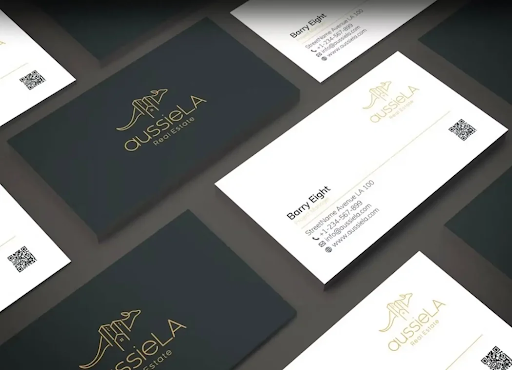
With a clear identity portrayed through a distinctive logo that applies to the brand name, along with ample space for essential details, this card strikes a balance between design and functionality.
Hilton & Hyland Christies: Cumming & Beisel
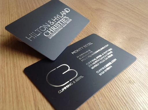
A card that exudes modern luxury with its silver engravements contrasted by minimalistic fonts.
The logo is striking, almost space-age, with the overall design giving a sense of upscale service.
Century 21
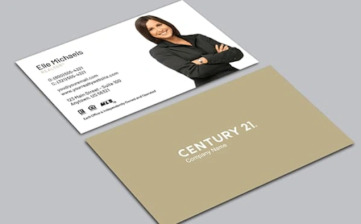
The use of Elle Michael’s image here provides a personal, face-recognition touch.
Paired with a clean, basic logo and plenty of contact information, it’s a simple but effective design.
The Perry
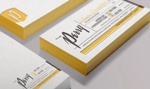
As a business card associated with a specific property, this one has a little more license for artistic expression.
The choice of font and indentations makes this card stunning, with the layout not just beautiful but thoughtfully crafted to guide the eye.
Maze Real Estate
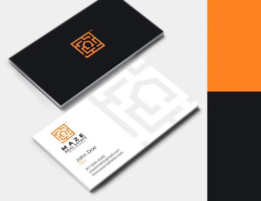
With a logo that clearly resonates with the name, this card is stylish and smart.
It reflects a brand identity that is at once innovative, artistic, and professional.
520 Park Avenue
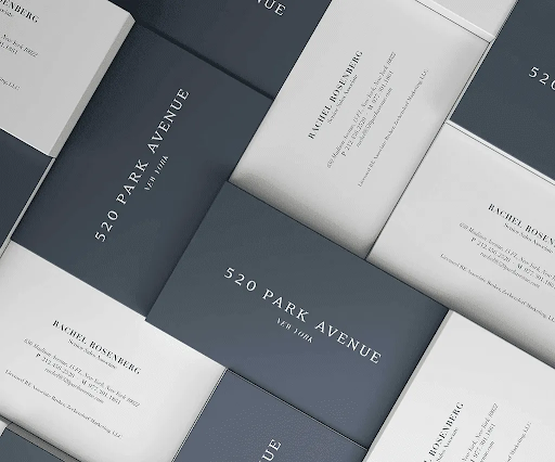
Again, as the business card associated with a famous apartment block, there’s a uniqueness to this card.
Every element of it, from the consistent font to a luxury style, screams class, directly reflecting the exclusivity of the building.
Vincer

Taking inspiration from Scandinavian design, the card uses a portrait style, uncommon in business cards, to complement its pleasing graphics.
It’s a testament to modern, innovative branding.
Seven Harrison TribecaVincer
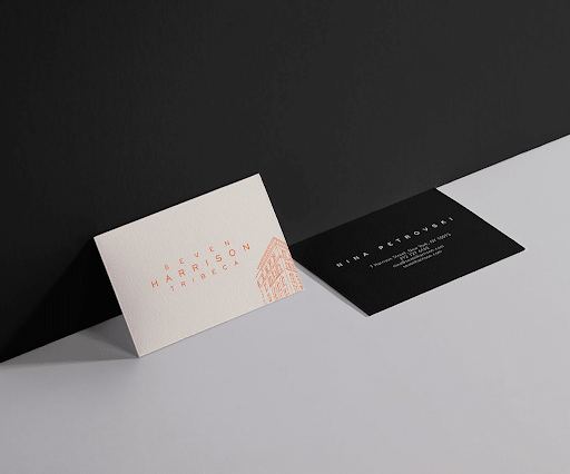
Again, this is a specific building’s branding, with the inclusion of an artistic rendering of the building on the card giving a direct insight into the property focus.
Westend Homes Edward Miller
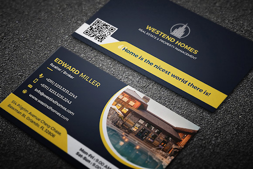
An effective, boldly straightforward blend of a catchy slogan, a clear image of the property, and neatly arranged contact info makes this card stand out.
Beehive Realty Group
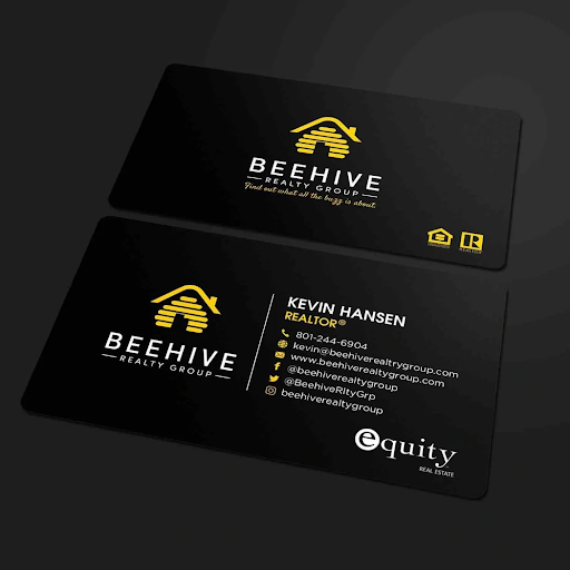
The multiple logos with a high contract level between the imagery, text, and background is daring but works.
It’s a vibrant yet professional design, including a cleverly relevant slogan.
Clara Padial
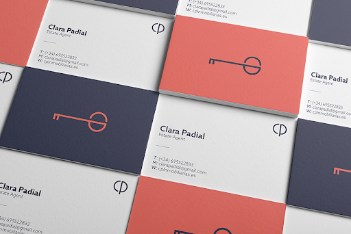
Designed by Lorenzo Bertello, Clara Padial’s card is a stunning example of personal branding with a logo perfect for a real estate professional.
The card’s design is simultaneously understated and captivating.
Carlyle Properties
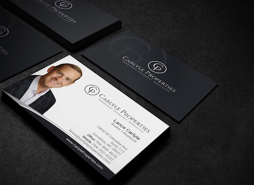
With the agent’s image coupled with a bold yet simple logo, this card builds immediate trust, with the Realtor certification further boosting credibility.
MB Real Estate
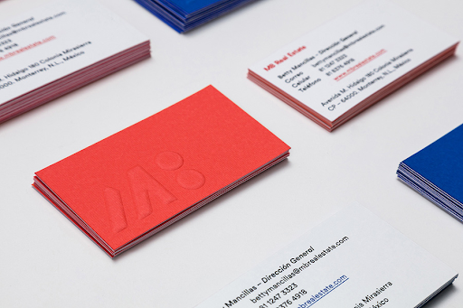
The elegantly indented logo on the primary colors of the card makes the design pop.
The use of the reverse side for information ensures the whole card leaves a lasting impression.
The right real estate business card should reflect your brand, stand out in a pile, and leave a lasting impression, prompting potential clients to reach out.
Maintaining Your Business Card
The real estate business card is a potent tool, but its power doesn’t end once it’s designed and printed. Maintaining and managing your business card impacts its efficacy.
Here’s how to ensure your card remains effective in your marketing efforts.
Keeping Your Information Up to Date
In the world of real estate, things change fast. Perhaps you’ve changed firms, gotten a new phone number, or expanded to a new social media platform.
Whatever it is, ensure your business card is up to date.
Relevance: Outdated information on your card is unprofessional and pointless.
An unreachable number or a defunct email only means missed opportunities.
Consistency across platforms: Ensure the information and branding on your business card aligns with what’s on all your platforms. This consistency builds trust and brand recognition.
Storing and Organizing Your Business Cards
Even in the digital age, the tangible feel of a card helps to forge the vital personal connections that real estate is built on, so it’s important to keep your cards in pristine condition.
Invest in a Business Card Holder: This protects your cards from wear and tear while allowing for quick access when networking.
Avoid Overstuffing: Stuffing too many cards into a holder can damage them, so it’s better to refill a spacious holder more often than to risk giving out a bent or worn card.
Stay Organized: If you have multiple versions of cards—e.g., one for luxury listings and another for standard properties—ensure they’re separated and easily distinguishable.
Following Up After Handing Out Your Card
Making the initial connection is just the first step; to cultivate relationships, follow-up is essential.
Timeliness is Key: If you promised to send a potential client more information or a listing, do so promptly. This demonstrates your professionalism and reliability.
Personalize Your Approach: Send personalized emails or brief notes mentioning your previous interaction to show recipients you’re keen to help them.
Stay Consistent: Regularly touch base with potential clients.
Consistency keeps you top-of-mind and reinforces your dedication.
Real estate business cards are still relevant and effective.
Proper maintenance, organization, and follow-up strategies ensure each card is an opportunity for growth and connection.
Conclusion
Real estate business cards are more than just pieces of cardstock; they are compact reflections of a realtor’s brand and commitment—don’t employ them half-heartedly.
To recap:
- Design matters
- Include essential information
- Variety and inspiration are key
- Maintenance and management make the difference
While digital platforms have significantly influenced the real estate industry, the tangible impact of business cards stands strong.
So, as you step out into the real estate world, ensure your business card is designed and used to its fullest potential.
For more real estate agent career tips, check out our blog today.

